
I found that analysing and testing the website to ensure that users can interact with the interface is a vital part of and product development, not only does it allow you to document the users experience and what they are feeling but it should also instigate improvements and change to the website. One of the most useful ways of evaluating the users experience and ensuring they can navigate the site well is the paper prototyping, you can critically analyse the interface and the way the subject interacts with it on a more personal level. When testing the website it is vital that you accurately record your findings, video recording the process it vital as on the first occasion you may overlook something that the user does or does not experience. This was a fundamental flaw in my work as i did not anticipate the user testing properly and did not record their navigation of the website. In future i hope to anticipate, plan and manage my time in a more effective way.
Monday 1 June 2009
Saturday 30 May 2009
Design Specification
The design specification provides vital information about the functional and non functional items that the website must include as well as not include. It allows us to identify the constraints ad work within these limitations when producing a website or any other type of interface. This allows the designers and creators of the interface to work along a specific guideline to ensure that the stakeholders needs are met, any mistakes in this part of the process may lead to the users satisfaction being compromised.
Friday 8 May 2009
Testing The Website
I took a screen grab of the Sainsbury’s website and asked three people the following questions:
Have you seen this website before?
What is the first thing you notice?
Do you like the colour scheme?
From your first impression what is the website about?
Is there anything you don’t like about the website?
Two of the users had seen this website before, the third had heard of the supermarket but never visited it online. the immediate impressions of the website were that it was very cluttered, the first thing they noticed and that stood out the most was the home insurance advert. When asked about the colour scheme people said it was boring but what you expect from a supermarket website. All three of the participants knew that it was a supermarket website and when asked about what they disliked one said “the colour” the second said “text is a little small” and the third said “not really bothered".
I then read this script to the participants:
“your task is to navigate the Sainsbury's website for groceries and purchase five items, one of the items you will have price check making sure that it is the cheapest. These are the items you will need to buy:
- 2 pints of organic semi skimmed milk
- a bottle of red wine that costs no more than £5
- one tin of chopped tin tomatoes
- one tin of spaghetti (price check)
- wholemeal unsliced bread
after you have selected the items you will have to go to the checkout using the details provided, then finally you must select a time and date for home delivery.
Finally i asked them to verbalise what they were doing, what they were feeling, and what they were thinking”
I didn't have a video camera to record my results because i had originally planned to get the users to navigate the site at a later date, because i was running ahead of schedule i decided to do the site navigation the same day, afterwards i realised this lead to the problem of not having any consent forms or questionnaire's done to collect information about the participants.
The first subject navigated the site well to get the products in the basket but he did accidentally click the wrong links at some points, he did let me know it wasn't because of the website it was because he wasn't used to using the touchpad on a laptop. The second problem he encountered was trying to find the checkout button, it took him a few seconds to realise where it was.
The second subject also did well on the navigation but it did take him a few seconds longer to find where things were on the site, this could have been due to his level of competence with computers, when he had finally finished the list i had to prompt him that he had put an incorrect item in the shopping trolley, he then asked how to take the sliced wholemeal bread out the trolley and replace it with unsliced. I asked him if he could try and figure it out for himself, he went back to the bread section of the website to see if he could remove it from there but then after 5 minutes or so removed it from the trolley section on the right by clicking on the dustbin next to the item name.
The third subject got frustrated very quickly as this was her first time online shopping, she said she felt she was going from page to page to get to an item and then having to go back to get to the next item. This was the most time consuming of the user tests as she kept navigating back to the home page to get to the next item. She compared it to “walking back to the doors of a supermarket in between putting items in the trolley”, then after putting the spaghetti in the trolley she realised that she didn’t have to click the back button of Firefox.
After these user test it clarified that the buttons were maybe a bit small and that people overlooked them, maybe making the buttons slightly larger and a little more obvious would increase productivity. I had originally planned to test the users and what the colour scheme also but, later realised that the orange colour they had on the website was a signature colour of Sainsbury's, if i were to change it it would mean they would have to change every colour across Britain.
Playing Catch-up
After realising that i didn't have any of the details of the users i tested i contacted each of them asking them for their details so that i could see how their details effected the way they navigated the website.
First User
Age: 20
Income: +£15k
Occupation: Royal Navy Weapons Engineer
What Is Your Computer Skill Level (worst 1-5 best): 4
How Many Times A Month Do You Shop Online? once or twice
Have you ever shopped at an online supermarket? no
If Yes Then What Supermarket And Why Did You Choose Them? N/A
Second User
Age: 62
Income: +£15k
Occupation: Retired
What Is Your Computer Skill Level (worst 1-5 best): 3
How Many Times A Month Do You Shop Online? Never
Have you ever shopped at an online supermarket? no
If Yes Then What Supermarket And Why Did You Choose Them? N/A
Third User
Age: 41
Income: +£15k
Occupation: Student & Part Time Cleaner
What Is Your Computer Skill Level (worst 1-5 best): 3
How Many Times A Month Do You Shop Online? Never
Have you ever shopped at an online supermarket? no
If Yes Then What Supermarket And Why Did You Choose Them? N/A
Wednesday 6 May 2009
Paper Prototyping Evaluation
I feel that in this instance the users of the interface were uncomfortable, and that they felt that they were being tested and not the website. In future i hope to make the users feel more comfortable.
I feel that the data we collected from the users could have been a little more qualitative, the information we had was slightly “thin” and this could have been improved if we had more questions about the prototype at the end and more users to test.
Tuesday 5 May 2009
Paper Prototyping
Paper prototyping is a low cost way of usability testing your website, the voluntary user interacts with a paper version of an interface. Another person will process the things they do on the paper version of the interface changing the page (the page represents the current screen of the interface) they are on. The reason this is so effective is because it can be used for virtually any type of human computer interface. The main purpose is to get quick and significant feedback from the user whilst documenting how they expected to navigate the interface. It is also very useful for documenting any problems or restrictions the user comes across with the interface. Paper prototyping does not need to be graphically or aesthetically pleasing as you are not documenting the response of the user to the colour schemes or images at this stage, that's not to say that you couldn't further your paper prototyping investigation with graphics, colours and fonts at a later stage.
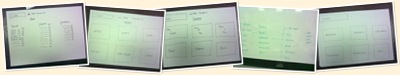
Firstly we developed a plan of the website and the pages we expected the user’s to navigate to, in case they navigated the complete wrong way we expected we also created a “loading” page and a “currently under construction” page.
below is a photo album of the screens we expected them to navigate through
We video recorded the results so we could analyse them in more depth than we would have if we had just documented the results on paper, this allowed us to go back and se if there was anything that we missed. as you will see from the video we had a script so that each user was told the same information before navigating the website, this ensured that the test was completely fair.
There seemed to be a reoccurring problem with navigating to the milk, people navigated to the drinks section of the interface, we anticipated this and we had the sheets for the drinks section of the website at hand. The conclusion was that because people would generally look in both sections of the interface for milk we should include it in both the drinks and the dairy section. This paper prototyping could be carried out on a much bigger scale to make the results of the test more accurate.
Wednesday 8 April 2009
Who Will Be Using The Website
Now that i have a list of basic functions that the site will have i need to identify who will be using the website, i came up with the following list:
Designer/design company The supermarket owners Public Business partners Media